· blog · 7 min read
Why you shoudn't use a slider on your website in 2023

The sliders or image carousel is one of the most challenging conversations a developer can have with a client. It would be best if you...
Introduction
The sliders or image carousel is one of the most challenging conversations a developer can have with a client. It would be best if you only used a slider to tell a story, make testimonials, or break up forms.
Here are six reasons why you shouldn’t use sliders.
Sliders are bad for web accessibility.

Sliders have many accessibility issues that make them a poor choice for a website. Sliders are often not accessible for:
- People who are blind use screen readers. Screen readers speak the text on web pages, so if there’s no text, there’s no way for blind users to interact with the slider or see what it contains. They land on a site after searching for content, and their screen readers start to read the navigation out loud. It reads the title and text, then it moves to the slider and starts reading all the alternative “alt” text of the image (a piece of code screen readers use for accessibility tools). So if you have more than ten images, you’re asking disabled users to wait a significant amount of time to have all the image text read off by their screen reader.
- People who are color blind and who can’t see color combinations used in some sliders like red and green will have a difficult time.
- People with disabilities find it challenging to use a mouse or keyboard (like those with Parkinson’s disease). This group may be unable to click through each slide because of their motor skills when using a touchscreen device such as a smartphone or tablet computer.
- It’s also essential to include people with poor internet when talking about accessibility. We want the site to load quickly over 3G and 4G networks.
Most sliders require too much optimization if you want them to be Accessibility Complaint.
Sliders work well on desktop computers but not on mobile devices. Most sliders are not optimized for mobile devices. Implementing sliders may sound easy since they are everywhere, but most need additional care and the love of a good developer to implement them correctly. Sliders, when created, require a developer to build two slide shows, one for desktops and tablets and one for mobile.
Sliders make your website slower, which is another reason you should refrain from using them. When people visit a website using a mobile device or tablet, the site will take longer to load because of all the images in the slider.
A slider will significantly increase page load times and page speed.

Why is this important? If your website loads slowly, you lose visitors. Google recommends that the average time it takes a mobile device to load a web page entirely is less than 4 seconds. It is 2023, it needs to be 2 seconds, or users will leave. Page speed is especially true if visitors access your site on a cellular network rather than WiFi.
The user may leave your site before it finishes loading or decides not to visit because they want to save their data plan. Either way, this will negatively impact your SEO rank and revenue stream.
Use sliders sparingly, in the right place at the right time for your content. The right time would be like telling a story or breaking up a form. Sliders are great for highlighting specific content but should not be used to promote a brand. They can be helpful sometimes, but you must ensure that publicized content is relevant to the audience and matches their needs.
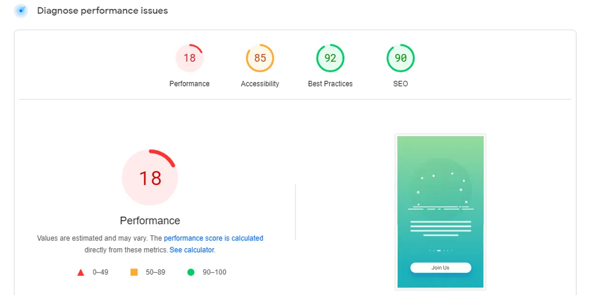
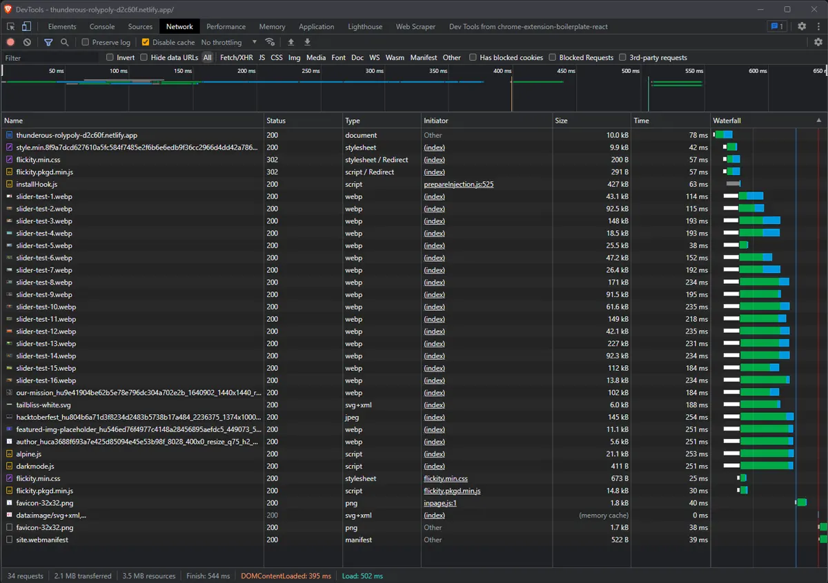
These are the results from the data.

I put together some test data to show you.

With the slider, we have 34 requests for assets (images and code) that make up the website. According to SEOptimer, in 2022, the average webpage was about 2.2 MegaBytes. So we’re coming in just under the average, but that is still a lot of data to pull. Suppose we’re making the web more accessible. That means that sites should be accessible to everyone.

I removed the slider and just used static content. You can see a dramatic difference in the resources that the page loads. Here we have 11 requests with only 1.7 MB of resources loaded. Sixteen images is a huge amount, but that isn’t an unusual client request. In this demo, we are doubling the webpage size when we add a slider. That may seem small, but it is considerable, especially if we ask users to download our site over 3G and 4G networks.
You will see much higher click-through rates with static content, especially the first piece of content that users see. You should be updating and regularly experimenting to get data from analytics. Clicks are votes on what users want to see.
People Ignore Them
Banner blindness is a phenomenon in which the viewer of an ad ignores it. The term was coined in 1994 by Jakob Nielsen, who noticed that users ignored banner ads on websites and instead focused on the page’s content. There are several factors attributed to banner blindness:
- Users are used to seeing ads and thus become accustomed to them. The repetition causes them to ignore the content altogether.
- The most common placement for banner ads is at the top or bottom of a website and is quickly lost when you scroll down your browser window.
- Some studies have shown that viewing time for banner ads is as low as .01 seconds.
- So, as a rule, if you use a slider - it is best not to autoplay them.
At this point, if I cannot persuade you, then these professionals can.
- Auto-Forwarding Carousels and Accordions Annoy Users and Reduce Visibility
- Should I Use a Carousel?
- Carousel Interaction Stats
- Why Sliders Are Bad
- Why Image Sliders Are Bad for Conversions
- Sliders in Web Design: To Use or Not to Use?
- Why You Should Not Use Image Sliders in 2023
- Why Sliders On Your Homepage Are Costing You Conversions
Conclusion
Remember that a slider can be a helpful tool when used sparingly and in the right place at the right time for your content. Sliders are rarely effective for users (approximately a 1-3% click-through rate. It is hugely beneficial for websites to use static content instead of sliders.
We must take web accessibility seriously, especially if you’re a city, state, or federal public service office or entity, especially when there could be possible litigation.
I suggest using sliders where they make sense, like telling a story by using specific steps. LinkedIn does this perfectly, and they’re fine there. They also do not autoplay. Users have to want to click. Forms are another place where you can use a slider to make large form areas more appealing, make users feel comfortable, and break up the form, so it’s easier for users to digest.